


There are more people affected by dyslexia than people on wheelchairs, after all
More and more research indicates that there are specific features that make a typeface difficult to read by people with dyslexia. It is a very tricky matter and the research is far from being conclusive on the topic; readability seems to be affected quite substantially by cultural norms and education: basically we read better the typefaces we are most used to. But there are specific features in the design of typefaces – we are talking here about the Latin alphabet – that are indeed problematic per se. Especially relevant is the case of those sans serif typefaces where letters such as
b, p, q, d
are made out of one shape only, flipped and rotated.
This parsimony of design has been in use for decades – the reasons are to be found in the cost of casting metal types – and it became a hallmark of distinction: sans serif typefaces set in this way have been praised for their simplicity, their elegance and purity: the more similar the glyphs, the more elegant the whole typeface results. Alphabets created in this spirit, such as Frutiger, became the paradigm for signage systems worldwide in the last fifty years.
Now, there is consensus that these features might actually be a nuisance for dyslexic readers and there is no gentle way to put it: similarities in the shapes of the letters make the text more difficult to read. Hence, new typefaces have been redesigned with the specific goal of avoiding identical shapes among letters.
Goffredo: “When, during a lecture on wayfinding, I displayed an alphabet in a typeface specifically designed for dyslexic readers next to an alphabet set in Frutiger I said something about the former looking to me like an eyesore and the latter being more beautiful, proportioned, aesthetically pleasing. These remarks were interpreted as passionate complaints about the fact that aesthetic values were ignored in the design of the typefaces for dyslexics. That was not the case and this is the crucial point that must be clarified: I stated – and sadly I think I will be saying it again and again for the rest of my life! – that the Frutiger typeface looks indeed so much more beautiful than OpenDyslexic typeface to me. Yes, I appreciate I might have said that very passionately: on a recent trip to Berlin I took more photos of the Metro signs – set in Transit, a beautiful Frutiger condensed type – than of the Pergamon Altar. Yes, I do consider that quest to simplicity a testament of the grandeur of so many type masters of the last decades, and yes, I can stare at those lowercases in awe for days. And, finally: yes, those letters look nothing but perfect to me.”
But.
But if it turns out that recent research is sound, and that those features are indeed an impediment to a more universal fruition of the text, then all those typefaces should be banned from any signage system, until redesigned accordingly. And again, there is no way to put it mildly: when we talk about wayfinding, when we talk about visual design and typography, do we want our designs to be accessible, yes or no? Would we condone non-inclusive contemporary architecture? Would we approve of a new building inaccessible by people on a wheelchair? We can still appreciate the exquisite elegance of the Spanish Steps in Rome – built in 1725 –
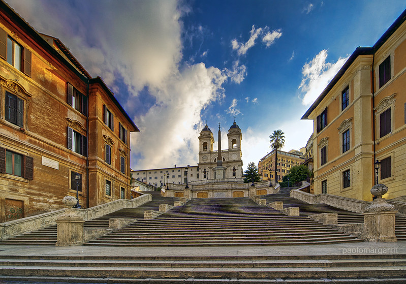 Image Credit: Paolo Margari
but we know that nowadays we would have built it as a gentle slope without a single step. We can still be moved by the exquisite beauty of the series of stairs that so effectively created a path from the steep hill of Trinità de’ Monti to Piazza di Spagna, and there is no change of design politics that will prevent those steps to remain the most perfect background for a tourist’s selfie. But we know that that architectural solution would not be approved today, as it impossible to be accessed by people with reduced mobility. When non accessible solutions are implemented, remediation is nowadays mandatory and costly as you will see in the next article.
So, do we mean that the overwhelming majority of wayfinding systems in place nowadays are wrong? Yes. Of course, they are wrong. If the research is right, the overall majority (and by a rapid guess, we are talking about the 99.9% of wayfinding systems in the West) of signage should be redone.
Do we mean that they should all be redesigned, taking users with dyslexia into account? Again: Yes. Of course. We should not allow any sign to be unnecessarily difficult to read, any more than we allow a mall or a car park to be unnecessarily difficult to access. There is after all way more dyslexic people than people using wheelchairs.
Do you mean to say that typefaces such as Johnston Underground, Frutiger, Transit – to name but three of the most exquisite sans serifs ever designed – should not be used anymore?
I am afraid we do. There is no contradiction here; just the acknowledgment of scientific and social progress. We now know what makes those typefaces not ideal and we should simply acknowledge this; after all they were created with the intention to solve problems, to be inclusive. Now that we know that this is not the case, we have to act accordingly.
That does not mean they are not beautiful anymore. They are and they will always be. And just like a trip to Rome will inspire generations of architects, so the identical shapes of the beautifully designed lowercase d p q and b of many sans serif typefaces will continue to inspire generations of designers. But their time as preferred choice for signage systems is over. And it is our duty to make this happen sooner than later.